我最近偶然发现了 这个 Pen,我的第一想法是它可以用三个元素完成:一个包装器、一个范围 input 和一个 output。在 CSS 方面,这涉及使用 conic-gradient(),其中一个停止点设置为 CSS 变量。

在 2015 年年中,Lea Verou 发布了 在一个会议演讲中,她演示了如何使用它们创建饼图。这个填充程序非常适合开始使用 conic-gradient(),因为它允许我们使用它们来构建在各个平台上都能正常运行的东西。不幸的是,它不适用于 CSS 变量,而 CSS 变量已成为如今编写高效代码的关键组成部分。
好消息是,在过去两年半的时间里,情况发生了一些变化。Chrome 以及通常使用 Blink 并公开标志的浏览器(例如 Opera)现在原生支持 conic-gradient()(太棒了!),这意味着现在可以使用 CSS 变量作为 conic-gradient() 停止点进行实验。我们只需要在 chrome://flags(或者如果您使用的是 Opera,则为 opera://flags)中启用 **实验性 Web 平台功能** 标志。

好了,现在我们可以开始啦!
初始结构
我们从一个包装器元素和一个范围 input 开始。
<div class="wrap">
  <input id="r" type="range"/>
</div>
请注意,我们没有 output 元素。这是因为我们无论如何都需要 JavaScript 来更新 output 元素的值,而且如果 JavaScript 被禁用或因某种原因失败,我们不想看到一个难看的、无用的、无法更新的元素。因此,我们将通过 JavaScript 添加此元素,并且根据当前浏览器是否支持 conic-gradient(),在包装器上添加一个类以表示这一点。
如果我们的浏览器支持 conic-gradient(),包装器将获得一个名为 .full 的类,我们将把 output 样式化为图表。否则,我们只有一个简单的滑块,没有图表,output 在滑块滑块上。

conic-gradient() 的浏览器中的结果(顶部)以及不支持它的浏览器中的回退结果(底部)。基本样式
在任何其他操作之前,我们想在所有浏览器中显示一个外观良好的滑块。
我们从最基本的重置开始,并在 body 上设置 background。
$bg: #3d3d4a;

* { margin: 0 }

body { background: $bg }
第二步是在 WebKit 浏览器中准备滑块以进行样式设置,方法是在滑块及其滑块上设置 -webkit-appearance: none(因为轨道默认情况下已设置它,原因不明),并且我们确保通过明确设置像 padding、background 或 font 这样的在不同浏览器之间不一致的属性来使字段保持一致。
[type='range'] {
  &, &::-webkit-slider-thumb { -webkit-appearance: none }

  display: block;
  padding: 0;
  background: transparent;
  font: inherit
}
如果您需要回顾滑块及其组件在不同浏览器中的工作原理,请查看我的 关于了解范围输入的详细文章。
现在,我们可以继续进行更有趣的部分。我们决定了轨道和滑块的尺寸,并通过相应的混合器将它们设置在滑块组件上。我们还将包括一些 background 值,以便我们在屏幕上看到一些东西,以及一个 border-radius 来美化事物。对于这两个组件,我们也重置了 border 为 none,以便在所有平台上获得一致的结果。
$k: .1;
$track-w: 25em;
$track-h: .02*$track-w;
$thumb-d: $k*$track-w;

@mixin track() {
  border: none;
  width: $track-w; height: $track-h;
  border-radius: .5*$track-h;
  background: #343440
}

@mixin thumb() {
  border: none;
  width: $thumb-d; height: $thumb-d;
  border-radius: 50%;
  background: #e6323e
}

[type='range'] {
  /* same styles as before */
  width: $track-w; height: $thumb-d;

  &::-webkit-slider-runnable-track { @include track }
  &::-moz-range-track { @include track }
  &::-ms-track { @include track }

  &::-webkit-slider-thumb {
    margin-top: .5*($track-h - $thumb-d);
    @include thumb
  }
  &::-moz-range-thumb { @include thumb }
  &::-ms-thumb {
    margin-top: 0;
    @include thumb
  }
}
我们添加了一些其他调整,例如在包装器上设置 margin、一个明确的 width 和一个 font。
.wrap {
  margin: 2em auto;
  width: $track-w;
  font: 2vmin trebuchet ms, arial, sans-serif
}
我们不想让它变得太小或太大,因此限制 font-size。
.wrap {
  @media (max-width: 500px), (max-height: 500px) { font-size: 10px }
  @media (min-width: 1600px), (min-height: 1600px) { font-size: 32px }
}
现在,我们得到一个漂亮的跨浏览器滑块。
查看 thebabydino 的 Pen (@thebabydino) 在 CodePen 上。
JavaScript 代码
我们从获取滑块和包装器以及创建 output 元素开始。
const _R = document.getElementById('r'),
      _W = _R.parentNode,
      _O = document.createElement('output');
我们创建了一个名为 val 的变量,用于存储范围 input 的当前值。
let val = null;接下来,我们有一个 update() 函数,它会检查当前滑块值是否等于我们已存储的值。如果不是,我们将更新 JavaScript val 变量、output 的文本内容以及包装器上的 CSS 变量 --val。
function update() {
  let newval = +_R.value;

  if(val !== newval)
    _W.style.setProperty('--val', _O.value = val = newval)
};
在继续进行 JavaScript 代码之前,我们在 output 上从 CSS 设置了一个 conic-gradient()。
output {
  background: conic-gradient(#e64c65 calc(var(--val)*1%), #41a8ab 0%)
}
我们通过调用 update() 函数、将输出作为包装器的子级添加到 DOM,然后测试 output 的计算后的 background-image 是否是我们设置的 conic-gradient()(请注意,我们需要在执行此操作之前将其添加到 DOM)来启动这些操作。
如果计算后的 background-image 不是 "none"(如果我们没有原生 conic-gradient() 支持,则会出现这种情况),那么我们在包装器上添加一个 full 类。我们还通过 for 属性将 output 连接到范围 input。
通过事件监听器,我们确保每次移动滑块滑块时都会调用 update() 函数。
_O.setAttribute('for', _R.id);
update();
_W.appendChild(_O);

if(getComputedStyle(_O).backgroundImage !== 'none')
  _W.classList.add('full');

_R.addEventListener('input', update, false);
_R.addEventListener('change', update, false);
现在,我们拥有一个滑块和一个 output(如果我们在支持原生 conic-gradient() 支持的浏览器中查看它,它会在一个可变的 conic-gradient() 背景上显示其值)。在这个阶段,它仍然很丑陋,但它很有用——每次我们拖动滑块时,output 都会更新。
查看 thebabydino 的 Pen (@thebabydino) 在 CodePen 上。
我们还为 output 提供了一个浅色的 color 值,以便我们可以更好地看到它,并通过 ::after 伪元素在末尾添加一个 %。我们还通过将它的 display 设置为 none 来隐藏了 Edge 中的工具提示 (::-ms-tooltip)。
无图表情况
这是我们没有 conic-gradient() 支持的情况,因此我们没有图表。我们想要实现的结果如下所示。

美化输出
在这种情况下,我们绝对定位 output 元素,使其占据滑块的尺寸,并将它的文本放在正中间。
.wrap:not(.full) {
  position: relative;

  output {
    position: absolute;

    /* ensure it starts from the top */
    top: 0;

    /* set dimensions */
    width: $thumb-d; height: $thumb-d
  }
}

/* we'll be using this for the chart case too */
output {
  /* place text in the middle */
  display: flex;
  align-items: center;
  justify-content: center;
}
如果您需要回顾 align-items 和 justify-content 的工作原理,请查看 这篇关于 CSS 对齐的全面文章,作者为 Patrick Brosset。
结果可以在下面的 Pen 中看到,我们在那里还设置了一个 outline,以便清楚地看到 output 的边界。
查看 thebabydino 的 Pen (@thebabydino) 在 CodePen 上。
这开始看起来有点像东西了,但是我们的 output 并没有随着滑块滑块移动。
使输出移动
为了解决这个问题,让我们首先记住滑块滑块的运动原理。在 Chrome 中,滑块的 border-box 在轨道的 content-box 的限制内移动,而在 Firefox 和 Edge 中,滑块的 border-box 在实际滑块的 content-box 的限制内移动。
虽然这种不一致可能在某些情况下会导致问题,但我们这里的用例很简单。我们在滑块或其组件上没有边距、填充或边框,因此这三个框 (content-box、padding-box 和 border-box) 与滑块本身及其轨道和滑块组件重合。此外,实际 input 的三个框的宽度与它的轨道的三个框的宽度一致。
这意味着当滑块值处于最小值(我们没有显式设置它,因此它是默认的 0)时,滑块的框的左边缘与 input(以及轨道的)的左边缘一致。
此外,当滑块值达到最大值时(再次强调,没有明确设置,因此它取默认值100),拇指框的右边缘与input的右边缘(以及轨道)重合。这使得拇指的左边缘比滑块(以及轨道的)右边缘提前一个拇指宽度($thumb-d) (位于左侧)。
下图显示了它相对于输入宽度($track-w)——这被显示为1。拇指宽度($thumb-d)被显示为输入宽度的几分之一k(因为我们将其设置为$thumb-d: $k*$track-w)。

由此可知,拇指的左边缘在最小值和最大值之间移动了输入宽度($track-w)减去拇指宽度(thumb-d)。
为了以相同的方式移动output,我们使用一个平移。在初始位置,我们的output位于拇指的最左侧位置,当滑块值处于最小值时所处的位置,因此我们使用的transform是translate(0)。为了将其移动到滑块值处于最大值时拇指所处的位置,我们需要将其平移$track-w - $thumb-d = $track-w*(1 - $k)。

output的运动范围(实时演示)。好的,但中间的值怎么办呢?
嗯,请记住,每次滑块值更新时,我们不仅将新值设置为output的文本内容,还将其设置为包装器上的CSS变量--val。这个CSS变量在左侧端(当滑块值处于最小值时,在本例中为0)和右侧端(当滑块值处于最大值时,在本例中为100)之间变化。
因此,如果我们沿着水平(x)轴将output平移calc(var(--val)/100*#{$track-w - $thumb-d}),它就会随着拇指一起移动,而我们无需做任何其他操作。
查看 thebabydino 在 CodePen 上创建的 Pen(@thebabydino)。
请注意,如果我们在轨道上的其他地方点击,上述方法有效,但如果我们尝试拖动拇指,则无效。这是因为output现在位于拇指之上,并捕获了我们的点击。
我们通过在output上设置pointer-events: none来解决这个问题。
查看 thebabydino 在 CodePen 上创建的 Pen(@thebabydino)。
在上面的演示中,我们还删除了output元素上的丑陋的outline,因为我们不再需要它。
现在我们已经为不支持原生conic-gradient()的浏览器提供了一个不错的备用方案,我们可以继续为那些支持该方案的浏览器(启用了标志的Chrome/Opera)构建我们想要的结果。
图表案例
绘制所需布局
在我们开始编写任何代码之前,我们需要清楚地了解我们想要实现的目标。为了做到这一点,我们绘制一个布局草图,其尺寸相对于轨道宽度($track-w),它也是input的宽度以及包装器content-box的边缘(不包括包装器的padding)。
这意味着我们的包装器的content-box是一个边长为1的正方形(相对于轨道宽度),input是一个矩形,它的一条边与包装器的一条边重合且相等,另一条边是该边长度的k倍,而它的拇指是一个kxk的正方形。

图表是一个边长为1 - 2·k的正方形,它与滑块的对面包装器边缘相接触,距离滑块k个间隙,并且沿着另一个方向处于中间位置。鉴于包装器的边长为1,图表边长为1 - 2·k,因此沿着这个方向,包装器边缘和图表边缘之间也有k个间隙。
调整元素大小
获得这种布局的第一步是使包装器成为正方形,并将output的尺寸设置为(1 - 2*$k)*100%。
$k: .1;
$track-w: 25em;
$chart-d: (1 - 2*$k)*100%;

.wrap.full {
  width: $track-w;

  output {
    width: $chart-d; height: $chart-d
  }
}
结果可以在下面看到,我们还添加了一些轮廓,以便更好地观察。

conic-gradient()支持时)。这是一个良好的开端,因为output已经处于我们想要的位置。
使滑块垂直
对于WebKit浏览器,执行此操作的“官方”方法是在范围input上设置-webkit-appearance: vertical。但是,这将破坏自定义样式,因为它们要求我们将-webkit-appearance设置为none,而我们不能同时将其设置为两个不同的值。
因此,我们唯一方便的解决方案是使用transform。就目前而言,滑块的最小值位于包装器的左侧,最大值位于右侧。我们想要的是将最小值放在包装器的底部,最大值放在包装器的顶部。

这听起来像是围绕右上角(这给了我们一个水平方向为100%,垂直方向为0%的transform-origin)以负方向旋转90°(因为顺时针方向为正方向)。
查看 thebabydino 在 CodePen 上创建的 Pen(@thebabydino)。
这是一个良好的开端,但现在我们的滑块超出了包装器的边界。为了决定将它带入所需位置的最佳下一步,我们需要了解这次旋转做了什么。它不仅旋转了实际的input元素,还旋转了它的局部坐标系。现在,它的x轴指向上方,y轴指向右侧。
因此,为了将其带入包装器的右侧边缘,我们需要在旋转后沿着其y轴的负方向将其平移其自身的高度。这意味着我们应用的最终transform链是rotate(-90deg) translatey(-100%)。(请记住,在translate()函数中使用的%值是相对于被平移元素本身的尺寸)。
.wrap.full {
  input {
    transform-origin: 100% 0;
    transform: rotate(-90deg) translatey(-100%)
  }
}
这给了我们所需的布局。

conic-gradient()支持时)。设置图表样式
当然,第一步是使用border-radius使其圆形,并调整color、font-size和font-weight属性。
.wrap.full {
  output {
    border-radius: 50%;
    color: #7a7a7a;
    font-size: 4.25em;
    font-weight: 700
  }
}您可能已经注意到,我们将图表的尺寸设置为(1 - 2*$k)*100%而不是(1 - 2*$k)*$track-w。这是因为$track-w是一个em值,这意味着计算出的像素等效值取决于使用它的元素的font-size。
但是,我们希望能够在这里增加font-size,而无需调整em值的大小。这是可能的,而且并不复杂,但与仅将尺寸设置为不依赖于font-size的%值相比,它仍然需要做一些额外的工作。

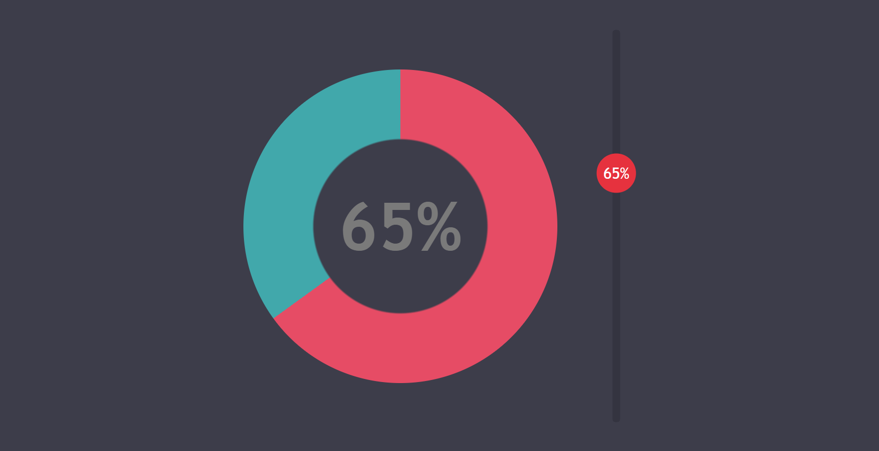
conic-gradient()支持时)。从饼图🥧到甜甜圈🍩
模拟中间那个洞的最简单方法是在conic-gradient()层之上添加另一个background层。我们可能可以添加一些混合模式来实现,但除非我们有图像background,否则这不是必需的。对于我们这里使用的纯色background,一个简单的覆盖层就足够了。
$p: 39%;
background: radial-gradient($bg $p, transparent $p + .5% /* avoid ugly edge */),
            conic-gradient(#e64c65 calc(var(--val)*1%), #41a8ab 0%);
好了,图表本身就是这样了!

conic-gradient()支持时)。在拇指上显示值
我们使用一个绝对定位的 `::after` 伪元素来实现这个效果,这个伪元素位于 `wrapper` 元素上。我们将这个伪元素的尺寸设置为滑块的拇指大小,并将其定位在 `wrapper` 元素的右下角,也就是当滑块的值处于最小值时拇指的位置。
.wrap.full {
  position: relative;

  &::after {
    position: absolute;
    right: 0; bottom: 0;
    width: $thumb-d; height: $thumb-d;
    content: '';
  }
}
我们还给它设置了一个边框,以便我们能够看到它。

让拇指和伪元素一起移动的方式与没有图表的情况完全相同,只是这次平移发生在 `y` 轴上,并且是负方向(而不是沿着 `x` 轴正方向)。
transform: translatey(calc(var(--val)/-100*#{$track-w - $thumb-d}))为了能够在拇指下方进行拖动,我们还必须在这个伪元素上设置 `pointer-events: none` 属性。最终效果如下:拖动拇指也会移动 `wrapper` 的 `::before` 伪元素。

好的,但我们真正想要的是使用这个伪元素来显示当前值。将它的 `content` 属性设置为 `var(--val)` 并不能实现这个功能,因为 `--val` 是一个数值,而不是字符串。如果我们将其设置为字符串,我们可以使用它作为 `content` 属性的值,但我们不能再使用它来进行 `calc()` 计算了。
幸运的是,我们可以使用一个巧妙的技巧来解决这个问题,那就是使用 CSS 计数器。
counter-reset: val var(--val);
content: counter(val)'%';
现在整个功能都实现了,太棒了!

接下来让我们进行美化,并添加一些不错的细节。我们将文本放置在拇指的中间,将其设置为 `white`,移除所有边框,并在 `input` 上设置 `cursor: pointer` 属性。
.wrap.full {
  &::after {
    line-height: $thumb-d;
    color: #fff;
    text-align: center
  }
}

[type='range'] {
  /* same as before */
  cursor: pointer
}
最终效果如下:
消除重复
让我感到困扰的一件事是,我们在没有图表的情况下的 `output` 元素和图表情况下 `wrap:after` 元素上有很多共同的样式。

我们可以通过 使用一个静默类并扩展它 来解决这个问题。
%thumb-val {
  position: absolute;
  width: $thumb-d; height: $thumb-d;
  color: #fff;
  pointer-events: none
}

.wrap {
  &:not(.full) output {
    @extend %thumb-val;
    /* same other styles */
  }

  &:after {
    @extend %thumb-val;
    /* same other styles */
  }
}
不错的焦点样式
假设我们不想在 `:focus` 状态下显示难看的 `outline`,但我们也希望以一种清晰的方式在视觉上区分这种状态。那么我们该怎么做呢?假设我们可以在 `input` 不处于焦点状态时缩小拇指,使其略微不饱和,并在此情况下隐藏文本。
听起来是个不错的想法,但是,由于我们没有父选择器,因此无法在滑块获得或失去焦点时触发滑块父元素的 `::after` 伪元素上的属性更改。真是太糟糕了。
我们可以做的是使用 `output` 元素的另一个伪元素(`::before`)在拇指上显示值。这种方法并非没有问题,我们将在稍后讨论这些问题,但它允许我们进行如下操作:
[type='range']:focus + output:before { /* focus styles */ }这种方法的问题在于,我们扩大了 `output` 元素本身的 `font` 属性,但在它的 `::before` 伪元素上,我们需要它与 `wrapper` 上的 `font` 属性的大小和粗细相同。
我们可以通过将一个相对字体大小设置为一个 Sass 变量 `$fsr`,然后使用这个值来扩大实际 `output` 元素的 `font` 属性,并将它在 `output:before` 伪元素上恢复到原来的大小来解决这个问题。
$fsr: 4;

.wrap {
  color: $fg;

  &.full {
    output {
      font-size: $fsr*1em;

      &:before {
        /* same styles as we had on .wrap:after */
        font-size: 1em/$fsr;
        font-weight: 200;
      }
    }
  }
}
除了这些,我们只需要 将 `wrap:after` 伪元素上的 CSS 声明移动到 `output:before` 伪元素上 即可。

好的,现在我们可以继续进行区分正常状态和焦点状态的最后一步。
首先,当滑块未处于焦点状态时,我们将隐藏难看的 `:focus` 状态 `outline` 和拇指上的值。
%thumb-val {
  /* same styles as before */
  opacity: 0;
}

[type='range']:focus {
  outline: none;

  .wrap:not(.full) & + output,
  .wrap.full & + output:before { opacity: 1 }
}
接下来,我们为滑块拇指的正常状态和焦点状态设置不同的样式。
@mixin thumb() {
  /* same styles as before */
  transform: scale(.7);
  filter: saturate(.7)
}

@mixin thumb-focus() {
  transform: none;
  filter: none
}

[type='range']:focus {
  /* same as before */
  &::-webkit-slider-thumb { @include thumb-focus }
  &::-moz-range-thumb { @include thumb-focus }
  &::-ms-thumb { @include thumb-focus }
}
最后一步是在这些状态之间添加过渡效果。
$t: .5s;

@mixin thumb() {
  /* same styles as before */
  transition: transform $t linear, filter $t
}

%thumb-val {
  /* same styles as before */
  transition: opacity $t ease-in-out
}
屏幕阅读器呢?
由于现在的屏幕阅读器可以读取生成的文本,因此在这种情况下,`%` 值会被读取两次。为了解决这个问题,我们在 `output` 元素上设置 `role='img'` 属性,然后在 `aria-label` 属性中添加我们想要读取的当前值。
let conic = false;

function update() {
  let newval = +_R.value;

  if(val !== newval) {
    _W.style.setProperty('--val', _O.value = val = newval);
    if(conic) _O.setAttribute('aria-label', `${val}%`)
  }
};

update();

_O.setAttribute('for', _R.id);
_W.appendChild(_O);

if(getComputedStyle(_O).backgroundImage !== 'none') {
  conic = true;
  _W.classList.add('full');
  _O.setAttribute('role', 'img');
  _O.setAttribute('aria-label', `${val}%`)
}
最终演示如下。请注意,只有在你的浏览器不支持原生 `conic-gradient()` 时,你才会看到备用效果。
查看由 thebabydino (@thebabydino) 在 CodePen 上创建的 Pen。
结语
虽然浏览器对这种功能的支持仍然很差,但这种情况会改变。目前,只有 Blink 浏览器公开了一些标志,但 Safari 将 `conic-gradient()` 列为 开发中,所以情况正在好转。
如果你希望跨浏览器支持尽早成为现实,你可以通过投票 在 Edge 中实现 `conic-gradient()` 或在 Firefox 的 bug 上留言,说明你认为这项功能的重要性或你脑海中的用例。 这里有一些用例可以作为灵感。
很棒的文章,Ana。感谢你的撰写!
我喜欢我们可以通过自定义属性与 JavaScript 和 CSS 交互的方式。感觉比以前我们使用的一些方法要干净得多。
未来(和现在)看起来非常光明 :)
你提到 CSS 变量现在很关键。你是指原生 CSS 变量还是预处理器变量?
当我提到“CSS 变量”时,我指的是原生变量。否则,我只会说预处理器变量。