我最近需要制作一个类似报纸的设计,其中包含多个行和列跨度以及它们之间的分隔线。请看这里的设计草图,看看它是否让你感到头疼。如果你像我一样,你已经在这行做了很长时间了,也知道用旧的布局技术要完成这项任务是多么困难。

这个项目有几个要求
- 显示网格的轮廓
- 列可以比其他列更宽或更长
- 必须在不同块之间显示分隔线
CSS Grid:赋予旧版式新技巧
报纸版式可能会让人头疼,因为日常 CSS 是一维的,这意味着元素在水平或垂直轴上流动。 即使是现代的 flexbox 布局仍然是单向的。
对于这样的布局,我们几乎需要以前良好的 HTML 表格提供的属性:诸如行和列跨度以在所有方向上拉伸单元格。我们还需要现代 CSS 的优势,包括所有响应式和灵活的盒子,它们可以扩展以填充可用空间。
CSS Grid 结合了表格的优点和灵活盒子的优点。事实上,Grid 甚至更好,因为它提供了 grid-gap 属性,用于在单元格之间创建间隙,同时考虑可用空间。虽然它功能强大,但我们如何才能在这些间隙的正中间创建分隔线呢?
让我们看看实现这一目标的三种技术。
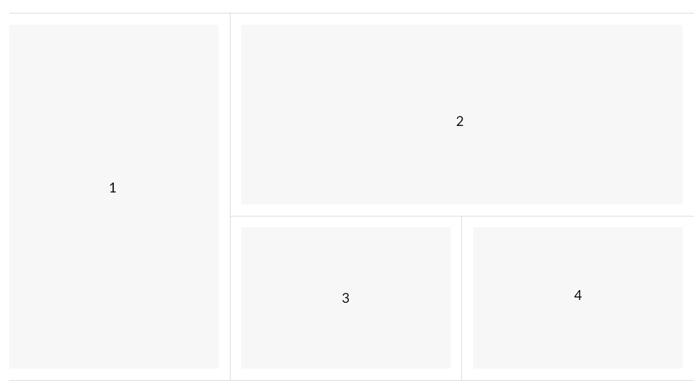
我们将创建什么
首先,我们将构建报纸设计的简化版本,这将有助于说明我们将介绍的三种不同技术的关键。有人会说,这是一个看似简单的设计。
技术 1:伪列
此解决方案创建“伪”列,使我们能够绘制垂直线,然后在上面放置网格。如果需要,水平分隔线将被绘制出来。“伪”列是通过在网格容器中使用伪选择器创建的。
<div class="frontpage">
  <div class="fp-cell fp-cell--1">
    <div class="fp-item">1</div>
  </div>
  <div class="fp-cell fp-cell--2">
    <div class="fp-item">2</div>
  </div>
  <div class="fp-cell fp-cell--3 fp-cell--border-top">
    <div class="fp-item">3</div>
  </div>
  <div class="fp-cell fp-cell--4 fp-cell--border-top">
    <div class="fp-item">4</div>
  </div>
</div>
查看 CodePen 上的示例:
报纸设计,“伪列”技术 by Marco Troost (@marco-troost)
在 CodePen 上。
设置列之间的线条
让我们使用 display: grid 和伪选择器 (:before 和 :after) 创建一个三列容器,以创建两列,它们填充容器的 100% 高度。
.frontpage {
  position: relative;
  display: grid;
  /* Three columns */
  grid-template-columns: 1fr 1fr 1fr;
  grid-column-gap: 32px;
  border: 1px solid transparent;
  border-top: 1px solid #DADCE0;
  border-bottom: 1px solid #DADCE0;
  overflow: hidden;
}

/* Two faux columns */
.frontpage:before,
.frontpage:after {
  position: absolute;
  top: 0;
  height: 100%;
  content: '';
  width: calc(33.3% - 4px);
}

.frontpage:before {
  left: 0;
  border-right: 1px solid #DADCE0;
}

.frontpage:after {
  right: 0;
  border-left: 1px solid #DADCE0;
}注意:容器的 33% 没有考虑间隙宽度,因此您需要相应地进行补偿。
计算公式如下:
33% minus (gutter-width divided by (amount of gutters times amount of gutters)) divided by amount of gutters)或者,使用实际数字
33% - (32 / (2* 2)) / 2 = 4我们可以使用一个伪选择器来代替
.frontpage {
  position: relative;
  display: grid;
  grid-template-columns: 1fr 1fr 1fr;
  grid-column-gap: 32px;
  border: 1px solid transparent;
  border-top: 1px solid #DADCE0;
  border-bottom: 1px solid #DADCE0;
  overflow: hidden;
}

.frontpage:before {
  box-sizing: border-box;
  position: absolute;
  top: 0;
  height: 100%;
  content: '';
  left: calc(33.3% - 5.3px);
  width: calc(33.3% + 10.7px);
  border-left: 1px solid #DADCE0;
  border-right: 1px solid #DADCE0;
}
查看 CodePen 上的示例:
新闻网格布局,“伪列”(仅使用 :before) by Marco Troost (@marco-troost)
在 CodePen 上。
注意:仅使用一个伪选择器时,需要进行不同的计算:一个用于定位,另一个用于宽度。
宽度计算公式如下:
33% plus (amount of gutters times gutter-width) / (amount of gutters times amount of columns)再次使用实际数字
33% + (2 * 32) / (2 * 3) = 10.7位置计算公式如下:
33% minus (amount of gutters times gutter-width) / (amount of gutters times amount of columns) divided by 2)制作网格
该设计包含四个内容块。我们将把它们放在容器中,并为它们提供一个修饰符类以供将来参考,同时确保它们的 z-index 高于网格的伪选择器。
<div class="frontpage">
  <div class="fp-cell fp-cell--1"></div>
  <div class="fp-cell fp-cell--2"></div>
  <div class="fp-cell fp-cell--3"></div>
  <div class="fp-cell fp-cell--4"></div>
</div>
现在,让我们将单元格 (.fp-cell) 的背景色设置为白色。这样,垂直线就不会显示出来。我们还可以将单元格的垂直填充设置为 16px,以匹配间隙的一半。
第一个和第二个内容块应该获得它们自己的唯一跨度,如设计所示。第一个块跨越整个高度,第二个块跨越第二列和第三列。
.fp-cell {
  position: relative;
  z-index: 2;
  padding: 16px 0;
  background-color: #fff;
}

/* Span all the way down! */
.fp-cell--1 {
  grid-row: 1 / span 2;
}

/* Span the second and third columns */
.fp-cell--2 {
  grid-column: 2 / span 2;
}
垂直分隔线
如果你看一下设计,只有最后两个单元格需要水平边框。我们可以为它们提供一个很棒的修饰符类。
<div class="frontpage">
  <div class="fp-cell fp-cell--1"></div>
  <div class="fp-cell fp-cell--2"></div>
  <div class="fp-cell fp-cell--3 fp-cell--border-top"></div>
  <div class="fp-cell fp-cell--4 fp-cell--border-top"></div>
</div>
.fp-cell--border-top:before {
content: '';
position: absolute;
top: 0;
left: -16px;
right: -16px;
border-top: 1px solid #DADCE0;
}负边距是间隙宽度的一半。
技术 #2:使用背景色
另一种创建分隔线的方法是利用 grid-gap 属性。此解决方案不一定在单元格之间创建“实际”距离,而是留出一些空白区域,网格的 background-color 可以显示出来。间隙宽度被分配给网格单元格内的填充。
<div class="container">
  <div class="frontpage">
    <div class="fp-cell fp-cell--1">
      <div class="fp-item">1</div>
    </div>
    <div class="fp-cell fp-cell--2">
      <div class="fp-item">2</div>
    </div>
    <div class="fp-cell fp-cell--3">
      <div class="fp-item">3</div>
    </div>
    <div class="fp-cell fp-cell--4">
      <div class="fp-item">4</div>
    </div>
  </div>
</div>
.container {
overflow-x: hidden;
border-top: 1px solid #DADCE0;
border-bottom: 1px solid #DADCE0;
}
.frontpage {
position: relative;
display: grid;
grid-template-columns: 1fr 1fr 1fr;
grid-gap: 1px;
margin: 0 -16px;
background-color: #DADCE0;
}
.fp-cell {
background-color: #fff;
padding: 16px;
}
.fp-cell--1 {
grid-row: 1 / span 2;
}
.fp-cell--2 {
grid-column: 2 / span 2;
}
.fp-cell--3 {
grid-column: 2;
}
.fp-item {
background-color: #efefef;
display: flex;
align-items: center;
justify-content: center;
min-height: 200px;
height: 100%;
}
查看 CodePen 上的示例:
报纸设计,背景色技术 by Marco Troost (@marco-troost)
在 CodePen 上。
由于所有单元格都有额外的 16px 水平填充,因此网格需要偏移相同的距离。一个包装容器将处理溢出。
<div class="container">
  <div class="frontpage">
  <!-- ... -->
  </div>
</div>
.container {
border-top: 1px solid #DADCE0;
border-bottom: 1px solid #DADCE0;
overflow-x: hidden;
}
.frontpage {
position: relative;
display: grid;
grid-template-columns: 1fr 1fr 1fr;
grid-gap: 1px;
background-color: #DADCE0;
margin: 0 -16px;
}技术 #3:创建单元格边框
此解决方案为每个单元格添加右和底部边框。与上一个示例类似,grid-gap 是通过向单元格内容添加填充来模拟的。这意味着它还需要包裹在一个额外的容器中。
<div class="container">
  <div class="frontpage">
    <div class="fp-cell fp-cell--1">
      <div class="fp-item">1</div>
    </div>
    <div class="fp-cell fp-cell--2">
      <div class="fp-item">2</div>
    </div>
    <div class="fp-cell fp-cell--3">
        <div class="fp-item">3</div>
    </div>
    <div class="fp-cell fp-cell--4">
      <div class="fp-item">4</div>
    </div>
  </div>
</div>
.container {
border-top: 1px solid #DADCE0;
overflow-x: hidden;
}
.frontpage {
  margin: 0 -17px 0 -16px;
  position: relative;
  display: grid;
  grid-template-columns: 1fr 1fr 1fr;
}
.fp-cell {
padding: 16px;
background-color: #fff;
border-right: 1px solid #DADCE0;
border-bottom: 1px solid #DADCE0;
}
.fp-cell--1 {
grid-row: 1 / span 2;
}
.fp-cell--2 {
grid-column: 2 / span 2;
}
.fp-cell--3 {
grid-column: 2;
}
.fp-item {
background-color: #efefef;
display: flex;
align-items: center;
justify-content: center;
min-height: 200px;
height: 100%;
}
查看 CodePen 上的示例:
报纸设计,“单元格边框”技术 by Marco Troost (@marco-troost)
在 CodePen 上。
如前所述,每个单元格在右侧和底部都设置了边框。这里的主要技巧是使用网格的(非对称)负边距。这是为了补偿单元格的右边界。
.frontpage {
margin: 0 -17px 0 -16px;
position: relative;
display: grid;
grid-template-columns: 1fr 1fr 1fr;
}结论
奥卡姆剃刀原理 规定最简单的解决方案获胜。在我们的例子中,是第二种技术。但话说回来,其他解决方案也有很多优点,如果例如无法访问 DOM,它们可能会有用。
所有这些技术都有效。选择合适的技术取决于您的用例。第一种技术使用实际的 grid-gap 属性来创建间隙,但其他技术可能更易于理解……并且也可能更易于维护。
我一直为这个问题苦恼,直到 Thunderbird 通知我你的帖子出现。
我一直试图解决 %-tuned 背景图像渐变色停止的问题,但我的设计更简单(只是几列),所以我非常喜欢阅读你的文章。
谢谢!
“这个解决方案不一定能创建单元格之间的“真实”距离...”
应该是“边框”而不是“距离”吧?
嗨 Gust,技术 #2 中的“这个解决方案”指的是网格间隙不被用作“间隔符”(列之间)。
它使用网格间隙来模拟 1px 边框,因此这个解决方案并没有真正以其原始形式使用网格间隙属性。
技术 2 似乎是最简洁的。感谢分享这些技巧!
关于这一点,有两点说明
首先,文章说网格比弹性盒好,因为它提供了
grid-gap属性。请注意grid-gap已重命名为gap为了也适用于弹性盒和多列布局。(到目前为止,只有 Firefox 在弹性盒布局中支持它。)其次,CSS 工作组问题跟踪器上已经有一些关于如何正确设置单元格之间间隙样式的讨论,请查看 https://github.com/w3c/csswg-drafts/issues/2748。
我在 Reddit 上看到了它,我也做了自己的版本。非常酷的方法。
https://codepen.io/MichaelAndreuzza/pen/XWWLQyb?editors=1000
为什么不用盒阴影,而是用边框呢?也许我忽略了什么原因,但盒阴影似乎更简单,你可以对所有块使用相同的规则,阴影会彼此叠加,它们不会占用额外的空间或显示双线。