您是否曾经想过确保 (伪) 元素的任何内容都不会显示在其父元素的 border-box 之外?如果您不确定它是什么样子,假设我们想要以最少的标记和避免脆弱的 CSS 获得以下结果。

这意味着我们不能仅仅为了视觉目的添加任何元素,也不能通过多个部分创建形状,无论是直接创建还是通过蒙版创建。 我们还希望避免在生成的代码中出现很长的、很长的任何列表(例如十几个 background 图层或方框阴影或 polygon() 函数内的点),因为虽然结果可能很有趣,但实际上无法做到这一点!
鉴于箭头指向的部分,您认为我们如何才能实现这一点? 在查看下面的解决方案之前,您想尝试一下吗? 乍一看它很简单,但一旦您真正尝试一下,您就会发现它要困难得多。
标记
每个项目都是一个段落 (<p>) 元素。 我很懒,我用 Pug 从一个对象数组中生成了它们,这些对象数组包含项目的渐变停止列表及其段落文本
- var data = [
-   {
-     slist: ['#ebac79', '#d65b56'],
-     ptext: 'Pancake muffin chocolate syrup brownie.'
-   },
-   {
-     slist: ['#90cbb7', '#2fb1a9'],
-     ptext: 'Cake lemon berry muffin plum macaron.'
-   },
-   {
-     slist: ['#8a7876', '#32201c'],
-     ptext: 'Wafer apple tart pie muffin gingerbread.'
-   },
-   {
-     slist: ['#a6c869', '#37a65a'],
-     ptext: 'Liquorice plum topping chocolate lemon.'
-   }
- ].reverse();
- var n = data.length;

while n--
  p(style=`--slist: ${data[n].slist}`) #{data[n].ptext}
这 会生成 以下平淡无奇的 HTML
<p style='--slist: #ebac79, #d65b56'>Pancake muffin chocolate syrup brownie.</p>
<p style='--slist: #90cbb7, #2fb1a9'>Cake lemon berry muffin plum macaron.</p>
<p style='--slist: #8a7876, #32201c'>Wafer apple tart pie muffin gingerbread.</p>
<p style='--slist: #a6c869, #37a65a'>Liquorice plum topping chocolate lemon.</p>
基本样式
对于段落元素,我们设置了一个 font、尺寸和一个等于 height 值一半的 border-radius
$w: 26em;
$h: 5em;

p {
  width: $w; height: $h;
  border-radius: .5*$h;
  background: silver;
  font: 1.5em/ 1.375 trebuchet ms, verdana, sans-serif;
}
我们还设置了一个虚拟 background,这样我们就可以看到它们的限制
查看 thebabydino 的 Pen (@thebabydino) 在 CodePen 上。
段落背景
我们有三个从上到下的渐变,这意味着我们可以将它们中的每一个放在不同的布局框的限制内:顶部渐变层限制在 content-box 内,中间层限制在 padding-box 内,底部层限制在 border-box 内。如果您需要深入了解此技术的复习,请查看 这篇文章,但基本思想是您将这些布局框视为嵌套的矩形。

这几乎是浏览器 DevTools 如何呈现它们的。

您可能想知道为什么我们不会通过 background-size 给定的不同大小的渐变进行分层,这些渐变具有 background-repeat: no-repeat。 嗯,这是因为我们只能获得没有圆角的矩形。
使用 background-clip 方法,如果我们有一个 border-radius,我们的 background 图层将遵循它。 同时,我们设置的实际 border-radius 用于对 border-box 的角进行圆角处理;相同半径减去 border-width 对 padding-box 的角进行圆角处理。 然后我们再减去 padding 来对 content-box 的角进行圆角处理。
查看 thebabydino 的 Pen (@thebabydino) 在 CodePen 上。
那么让我们来编码吧!
我们设置一个 transparent border 和一个 padding。 我们通过切换到 box-sizing: border-box 来确保它们从我们设置的尺寸中减去。 最后,我们分层三个渐变:顶部渐变限制在 content-box 内,中间渐变限制在 padding-box 内,底部渐变限制在 border-box 内。
p {
  /* same styles as before */
  display: flex;
  align-items: center;
  justify-content: space-between;
  box-sizing: border-box;
  border: solid $b transparent;
  padding: $p;
  background:
    linear-gradient(#dbdbdb, #fff) content-box,
    linear-gradient(var(--slist)) padding-box,
    linear-gradient(#fff, #dcdcdc) border-box;
  text-indent: 1em;
}
我们还设置了一个 flex 布局和一个 text-indent 来将文本内容从横幅边缘移开
查看 thebabydino 的 Pen (@thebabydino) 在 CodePen 上。
编号
在我们继续进行棘手的部分之前,让我们先把段落编号处理掉!
我们使用 counter 将它们添加为 :after 伪元素上的 content 值。 我们首先使这个 :after 成为一个正方形,其边长等于段落 height(即 $h)减去顶部和底部的 border-width(均等于 $b)。 然后我们通过在上面设置 border-radius: 50% 将此正方形变成圆形。 我们使其 inherit 其父元素的 box-sizing 和 border,然后以类似于其父元素的方式设置其 background。
$d: $h - 2*$b;

p {
  /* same styles as before */
  counter-increment: c;

  &:after {
    box-sizing: inherit;
    border: inherit;
    width: $d; height: $d;
    border-radius: 50%;
    box-shadow:
      inset 0 0 1px 1px #efefef,
      inset 0 #{-$b} rgba(#000, .1);
    background:
      linear-gradient(var(--slist)) padding-box,
      linear-gradient(#d0d0d0, #e7e7e7) border-box;
    color: #fff;
    content: counter(c, decimal-leading-zero);
  }
}
好吧,这开始看起来像样了!
查看 thebabydino 的 Pen (@thebabydino) 在 CodePen 上。
我们还需要对这个 :after 伪元素的 CSS 进行一些调整——一个等于其父元素填充值的 margin-right 以及对其内部布局的调整,以便将数字放在正中间。 编号部分差不多就是这样了!
p {
  /* same styles as before */

  &:after {
    /* same styles as before */
    display: grid;
    place-content: center;
    margin-right: -$p;
    text-indent: 0;
  }
}
我们越来越接近了!
查看 thebabydino 的 Pen (@thebabydino) 在 CodePen 上。
棘手的部分
我们终于到了这里!
我们首先使用 :before 伪元素,将其绝对定位在 right 侧,并使其成为一个边长等于其父元素 height 的 square
p {
  /* same styles as before */
  position: relative;
  outline: solid 2px orange;

  &:before {
    position: absolute;
    right: -$b;
    width: $h;
    height: $h;
    outline: solid 2px purple;
    content: '';
  }
}
我们还给这个伪元素及其父元素设置了一些虚拟轮廓,这样我们就可以检查对齐方式
查看 thebabydino 的 Pen (@thebabydino) 在 CodePen 上。
好了,现在我们给这个 :before 设置一个虚拟 background,旋转它,然后给它设置一个 border-radius 和一个漂亮的 box-shadow
p {
  /* same styles as before */

  &:before {
    /* same styles as before */
    border-radius: $b;
    transform: rotate(45deg);
    box-shadow: 0 0 7px rgba(#000, .2);
    background: linear-gradient(-45deg, orange, purple);
  }
}
我们得到以下结果!
查看 thebabydino 的 Pen (@thebabydino) 在 CodePen 上。
现在我们有一个小问题::before 伪元素是绝对定位的,现在位于包含编号的 :after 伪元素的顶部! 我们可以通过在 :after 伪元素上设置 position: relative 来解决这个问题。
查看 thebabydino 的 Pen (@thebabydino) 在 CodePen 上。
事情开始变得有趣了!
限制背景渐变
首先,我们需要在 :before 伪元素的渐变上设置停止位置,以使它们与父元素的 bottom 和 top 边缘相匹配。 这是因为我们希望在父元素的 top 边缘有特定的十六进制值,在父元素的 bottom 边缘有特定的十六进制值。

由于我们已将正方形 :before 旋转了 45°,因此其左上角现在向上指向(反之,其右下角向下指向)。
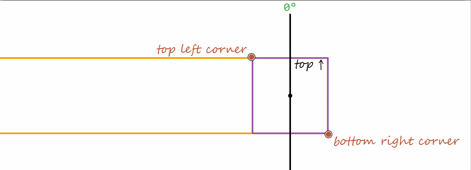
指向正方形左上角的渐变是 -45° 方向的渐变(因为 0° 角在 12 点钟位置,正方向与变换一样,是顺时针方向)。 指向角的渐变意味着 100% 点位于该角)

渐变的 50% 线始终穿过渐变框的中点(对角线相交的点)。
渐变框是在其中绘制渐变的框,其大小由 background-size 给定。 由于我们没有设置 background-size,因此渐变的默认设置是使用由 background-origin 定义的整个框,默认情况下为 padding-box。 由于我们的 :before 伪元素没有 border 或 padding,因此所有三个框(content-box、padding-box 和 border-box)在它们之间具有相等的间距,并且与渐变框的比例相同。
在我们的例子中,我们有以下垂直于 -45° 指向渐变线的线的

0%线,穿过:before的右下角- 伪元素的段落父元素的
bottom边缘 - 将正方形对角线分割成两个镜像的等腰直角三角形的
50%线;根据段落及其伪元素的对齐方式,这条线也是段落本身的中心线,将其分成两半,每半的height等于段落height的一半($h)。 - 伪元素段落父元素的
top边缘 100%线,穿过:before的左上角
这意味着我们需要将 :before 伪元素上的 -45° 指向的渐变限制在 calc(50% - #{.5*$h})(对应段落的 bottom 边缘)和 calc(50% + #{.5*$h})(对应段落的 top 边缘)之间。
当然,这确实可以做到!
linear-gradient(-45deg, orange calc(50% - #{.5*$h}), purple calc(50% + #{.5*$h}))请参阅 thebabydino 在 CodePen 上创建的 Pen (@thebabydino)。
在这些停止位置添加从透明到透明的急剧过渡,可以更明显地看出它们是正确的。
linear-gradient(-45deg,
      transparent calc(50% - #{.5*$h}), orange 0,
      purple calc(50% + #{.5*$h}), transparent 0)
请参阅 thebabydino 在 CodePen 上创建的 Pen (@thebabydino)。
限制伪元素本身
下一步是防止 :before 伪元素溢出其父元素的边界。
很简单吧?只需在段落上设置 overflow: hidden 就行了!
那就这么做吧!
这是我们得到的结果
请参阅 thebabydino 在 CodePen 上创建的 Pen (@thebabydino)。
糟糕,这不是我们想要的结果!

overflow: hidden(左)得到的结果与我们想要的结果(右)对比。问题是 overflow: hidden 会将元素 padding-box 外部的所有内容都裁剪掉,而我们这里想要的是裁剪 :before 伪元素在 border-box 外部的部分,而 border-box 在我们的例子中比 padding-box 大,因为我们有一个非零的 border,我们无法将其丢弃(并通过使 border-box 等于 padding-box 来解决问题),因为我们需要在段落上设置三个 background 层:最上面一层覆盖 content-box,中间一层覆盖 padding-box,最下面一层覆盖 border-box。
解决办法?如果你看了一下标签,你可能已经猜到了:使用 clip-path 代替!
几乎所有使用 clip-path 的文章和演示都使用 SVG 引用或 polygon() 形状函数,但这些并不是我们唯一的选择!
另一个可能的形状函数(也是我们在这里将要使用的)是 inset()。此函数指定一个裁剪矩形,该矩形由距 top、right、bottom 和 left 边缘的距离定义。什么边缘?默认情况下1,这是 border-box 的边缘,这正是我们这里需要的!

inset() 函数的工作原理。(Demo)所以让我们丢弃 overflow: hidden,改用 clip-path: inset(0)。这是我们得到的结果
请参阅 thebabydino 在 CodePen 上创建的 Pen (@thebabydino)。
这比以前好,但还不是我们想要的,因为它没有考虑到段落的 border-radius。幸运的是,inset() 也让我们可以指定一个圆角,它可以接受我们想要的任何 border-radius 值。没错,任何有效的 border-radius 值都可以使用——例如,这个
clip-path: inset(0 round 15% 75px 35vh 13vw/ 3em 5rem 29vmin 12.5vmax)不过我们只需要更简单的东西
$r: .5*$h;

p {
  /* same styles as before */
  border-radius: $r;
  clip-path: inset(0 round $r)
}
现在我们终于得到了我们想要的结果
请参阅 thebabydino 在 CodePen 上创建的 Pen (@thebabydino)。
最后的润色
由于我们不希望 :before 上出现紫色-橙色的渐变,因此我们将它们替换为我们需要的实际值。然后我们将段落放置在中间,因为这样看起来更好。最后,我们通过在 body 上设置 drop-shadow() 来为段落添加阴影(我们不能在段落本身使用 box-shadow,因为我们使用了 clip-path,它会裁剪掉 box-shadow,所以我们看不到它)。就是这样!
请参阅 thebabydino 在 CodePen 上创建的 Pen (@thebabydino)。
这么多想法…… 谢谢您!!!
OMG Ana,这真是下一级的 CSS!太棒了,教程的步骤和解释也令人难以置信。我会将其分享给整个前端团队作为展示案例。
我正在阅读这篇文章,我想知道你是否有一些针对初学者的 CSS 教程。我需要你教我一些东西!
我知道这与你试图实现的设计不完全相同,但如果我们不使用
p伪元素上的clip-path指令,而是简单地应用 3 个border-radius为50%和 1 个$r,我们将得到一个非常接近的结果,而且更容易处理。p {// -webkit-clip-path: inset(0 round $r);
// clip-path: inset(0 round $r);
&::before {
...
border-radius: 50% 50% 50% $b;
}
示例 在此
在再次阅读这篇文章之后(我总是对它的巧妙之处感到惊讶),我发现 #numbering 部分有一个小错误,你显示了
counter-increment: $d而不是实际使用的
counter-increment: c哎呀!现在已修复,感谢提醒!