对于那些错过重大新闻的人来说,Firefox 现在支持圆锥渐变!
从 Firefox 75 开始,于 4 月 7 日发布,我们可以进入 about:config,查找 layout.css.conic-gradient.enabled 标志并将它的值设置为 true(默认情况下为 false,只需双击它即可切换)。

启用后,我们现在可以在 Firefox 中测试包含圆锥渐变的 CSS。
虽然本文中的一些演示在使用 polyfill 时运行良好,但一些演示在圆锥渐变中使用 CSS 变量,因此需要对该功能的原生支持。
我对圆锥渐变特别喜欢的一点是它可以简化 background 图案。因此,让我们从 Lea Verou 大约十年前创建的 图库 中获取一些 linear-gradient() 图案,看看我们现在如何使用 conic-gradient 简化它们!
金字塔

上面的图案使用四个线性渐变
background:
  linear-gradient(315deg, transparent 75%, #d45d55 0) -10px 0,
  linear-gradient(45deg, transparent 75%, #d45d55 0) -10px 0,
  linear-gradient(135deg, #a7332b 50%, transparent 0) 0 0,
  linear-gradient(45deg, #6a201b 50%, #561a16 0) 0 0 #561a16;
background-size: 20px 20px;
这相当多的 CSS 代码,甚至可能有点吓人。仅仅通过查看它并不能很容易地理解它是如何组合在一起形成金字塔图案的。我肯定做不到。我花了一段时间才弄明白它,即使渐变是我最擅长的 CSS 功能之一。所以,如果你不理解这些渐变是如何形成金字塔图案的,不用担心,因为,第一,它确实很复杂,第二,你甚至不需要理解它!
使用 conic-gradient(),我们现在可以以更简单的方式获得相同的结果,使用单个 background 层而不是四个!
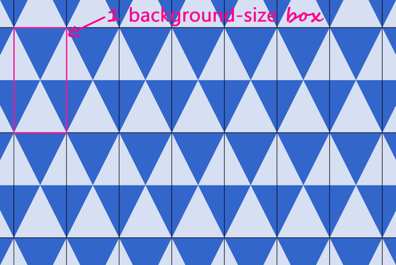
在编写重复图案时,我喜欢做的是绘制等距的垂直和水平线,以界定 background-size 定义的矩形框。在这种情况下,很明显我们有正方形框,以及它们的界限在哪里,但这对于更复杂的图案来说是一个非常有用的技巧。

默认情况下,圆锥渐变从 12 点钟开始,按顺时针方向进行。但是,在我们的案例中,我们希望将渐变的起点沿顺时针方向偏移 45°,然后让四个色调中的每一个占据正方形框中点周围可用空间的四分之一 (25%)。

这意味着我们的金字塔图案可以简化为
$s: 20px;
background:
  conic-gradient(from 45deg,
    #561a16 25%,
    #6a201b 0% 50%,
    #a7332b 0% 75%,
    #d45d55 0%)
    50%/ #{$s $s};
代码不仅看起来更简单,而且我们还将代码从 260 字节缩减到 103 字节,使获得此图案所需的代码减少了一半以上。
我们正在使用 双重位置 语法,因为它现在也得到了很好的支持。
我们可以在下面的 Pen 中看到它的实际效果
棋盘格

上面的图案使用两个线性渐变创建
background-color: #eee;
background-image:
  linear-gradient(45deg, black 25%, transparent 25%,
    transparent 75%, black 75%, black),
  linear-gradient(45deg, black 25%, transparent 25%,
    transparent 75%, black 75%, black);
background-size: 60px 60px;
background-position: 0 0, 30px 30px;
让我们看看在用圆锥渐变替换这些线性渐变时如何简化此 CSS 代码!
就像在前面的案例中一样,我们绘制垂直和水平线,以便更好地看到 background-size 定义的矩形。

查看上面图示中以 deeppink 突出显示的正方形,我们看到,在这种情况下,我们的圆锥渐变从默认位置 12 点钟开始。四分之一是黑色,下一个四分之一是脏白色,然后我们有重复(相同的黑色,然后是脏白色四分之一切片再次出现)。

在 [0%, 100%] 区间后半部分的这种重复意味着我们可以使用 repeating-conic-gradient(),这为我们提供了以下代码(将编译后的 CSS 从 263 字节减少到只有 73 字节 - 减少了 70% 以上)
$s: 60px;
background:
  repeating-conic-gradient(#000 0% 25%, #eee 0% 50%)
    50%/ #{$s $s};
下面的 Pen 显示了它的实际效果
对角线棋盘格

同样,我们有一个用两个线性渐变创建的图案
background-color: #eee;
background-image:
  linear-gradient(45deg, black 25%, transparent 25%,
    transparent 75%, black 75%, black),
  linear-gradient(-45deg, black 25%, transparent 25%,
    transparent 75%, black 75%, black);
background-size: 60px 60px;
我们绘制水平线和垂直线,将此图案分成相同的矩形

现在我们拥有的几乎与之前相同的棋盘格图案,唯一的区别是,我们不是从默认位置 12 点钟开始,而是从顺时针方向 45° 开始。
如果你难以想象仅仅改变起始角度就可以让我们从之前的图案转换到此图案,你可以在下面的交互式演示中进行尝试
请注意,此演示在不支持圆锥渐变的浏览器中无法使用。
这意味着我们的代码如下所示
$s: 60px;
background:
  repeating-conic-gradient(from 45deg,
    #000 0% 25%, #eee 0% 50%)
  50%/ #{$s $s};
我们可以在下面看到它的实际效果
同样,代码不仅更易于理解,而且我们还将编译后的 CSS 从 229 字节减少到只有 83 字节,减少了将近三分之二!
半菱形

此图案使用四个线性渐变创建
background: #36c;
background:
  linear-gradient(115deg, transparent 75%, rgba(255,255,255,.8) 75%) 0 0,
  linear-gradient(245deg, transparent 75%, rgba(255,255,255,.8) 75%) 0 0,
  linear-gradient(115deg, transparent 75%, rgba(255,255,255,.8) 75%) 7px -15px,
  linear-gradient(245deg, transparent 75%, rgba(255,255,255,.8) 75%) 7px -15px,
  #36c;
background-size: 15px 30px;
就像在前面的案例中一样,我们绘制等距的垂直和水平线,以便更好地看到重复单元
我们这里有一个图案,它由 全等 等腰三角形组成(倾斜的边相等,深蓝色三角形是浅蓝色三角形的镜像),由等距平行线的交点形成,这些平行线要么是水平的,要么是按顺时针方向倾斜的,要么是反方向的。下面图示中突出了每种类型的平行线

每个图案单元格包含一个完整的三角形和上部两个相邻的三角形一半,然后在下部对该上部进行镜像。这意味着我们可以识别出一组全等直角三角形,这些三角形将帮助我们获得 conic-gradient() 所需的角度

此图示向我们展示了渐变从相对于默认圆锥渐变起点 12 点钟的某个角度 β 开始。第一个圆锥切片(右上角一半的三角形)一直延伸到 α,第二个切片(右下角的深色三角形)一直延伸到 2·α,第三个切片(下面的浅色三角形)从起点绕圆周的一半(即 180° 或 50%)。第四个(左下角的深色三角形)一直延伸到 180° + α,第五个(左上角的浅色三角形)一直延伸到 180° + 2·α,而第六个切片覆盖了剩余部分。

从突出显示的直角三角形中,我们得到
tan(α) = (.5·h)/(.5·w) = h/w知道图案单元格的宽度 (w) 和高度 (h),我们可以得到角度 α 和 β
α = atan(h/w)
β = 90° - α
它产生了以下代码生成的图案
$w: 15px;
$h: 30px;
$a: atan($h/$w)*180deg/pi();
$b: 90deg - $a;
$c0: #36c;
$c1: #d6e0f5;

html {
  background:
    conic-gradient(from $b,
      $c1 0% $a,
      $c0 0% 2*$a,
      $c1 0% 50%,
      $c0 0% 180deg + $a,
      $c1 0% 180deg + 2*$a,
      $c0 0%)
    0 0/ #{$w $h};
}
这意味着将编译后的 CSS 从 343 字节减少到只有 157 字节。结果可以在下面看到
你可以在 Sass 代码中调整图案宽度 ($w) 和高度 ($h),以查看图案在不同纵横比下是如何被压缩和拉伸的。
在 2*$a 和 50%(或 180deg)之间的角度也为 $a 的特殊情况下,结果是 $a 为 60deg,我们的等腰三角形是等边的,我们的渐变可以简化为一个重复的渐变(在编译后的 CSS 中小于 100 字节)
$a: 60deg;
$b: 90deg - $a;
$w: 15px;
$h: $w*tan($a);
$c0: #36c;
$c1: #d6e0f5;

html {
  background:
    repeating-conic-gradient(from $b,
      $c1 0% $a, $c0 0% 2*$a)
    0 0/ #{$w $h}
}
实际结果可以在下面看到
额外:相交线背景!

虽然这些不是重复模式,但它们是单个圆锥渐变实现的效果示例,而以前可能需要大量线性渐变才能实现。
我们这里有一个 `conic-gradient()`,它从两条在设置 `background` 的矩形框内相交的直线开始创建。

渐变围绕两条直线相交点的坐标 `x,y` 进行。它从角度 `β` 开始,`β` 是最靠近右上角的线段的角度,然后在 `α`、`50%`(或 `180°`)和 `180° + α` 处有硬停止。
如果我们希望拥有多个具有类似模式的元素,这些模式是通过不同的相交线和不同的调色板创建的,那么 CSS 变量非常适合这种用例。
.panel {
  background:
    conic-gradient(from var(--b) at var(--xy),
      var(--c0) var(--a), var(--c1) 0% 50%,
      var(--c2) 0% calc(180deg + var(--a)), var(--c3) 0%);
}
我们所要做的就是设置位置 ( `--xy` )、起始角度 ( `--b` )、第一个角度 ( `--a` ) 和调色板 ( `--c0` 到 `--c3` )。
.panel {
  /* same as before */

  &:nth-child(1) {
    --xy: 80% 65%;
    --b: 31deg;
    --a: 121deg;
    --c0: #be5128;
    --c1: #ce9248;
    --c2: #e4c060;
    --c3: #db9c4e
  }

  /* similarly for the other panels */
}
除了硬编码之外,我们还可以使用 CSS 或 HTML 预处理器随机生成这些值,或者从数据对象中提取这些值。在第二种情况下,我们将内联设置这些自定义属性,这正是我在下面的 Pen 中所做的。
由于我们在圆锥渐变中使用自定义属性,因此此演示在不支持这些属性的浏览器中无法正常工作。
好了,就是这样!我希望您喜欢这篇文章,并且它能给您一些关于圆锥渐变如何让您的生活更轻松的想法。
Ana,你的工作真棒。
代码很巧妙,解释非常清晰,完美结合!
谢谢!
Ana,很棒的文章!作为一名 SEO 专家和网页开发者/偶尔的网页设计师,我特别对使用圆锥渐变节省的空间/加载时间量感到好奇。不幸的是,目前看起来这并不是一个非常可行的解决方案,因为兼容性问题似乎很严重。
您是否有支持和不支持圆锥渐变的浏览器列表?我很想看到那个列表,并且希望看到所有不重要、糟糕的浏览器都在不支持列表中,而所有我关心的浏览器都在支持列表中。
圆锥渐变在 Chromium 浏览器(现在也包括 Edge)中已支持大约三年(从 2017 年 6 月开始)。
在 Safari 中已经支持一年多了(从 2019 年 3 月开始)。
在 Firefox 中已经支持了几个月,尽管只在标志后面。但是,我记得对于基本的 `clip-path` 形状,在功能首次在标志后面落地和对所有人可用之间只经过了两个版本。因此,我预计它在今年晚些时候将不需要启用标志就可以正常工作。
CanIUse 有 一个完整的兼容性表。
底线:以前的 Chromium Edge/IE 和一些移动浏览器不支持它。但是,功能有限的浏览器可能也运行在功能有限的设备上。使用这些浏览器的人会欣赏更快的加载时间,即使他们得到的是纯色背景而不是模式。
因此,我个人认为,一旦 Firefox 在不需要标志的情况下支持它,它就成为一个可行的解决方案。只需记住为可能不支持它的任何浏览器设置一个纯色背景备用方案。
就我而言,支持浏览器 X 意味着确保页面易于使用,而不是复制使用尖端技术创建的所有视觉效果。
感谢您撰写这篇很棒的文章,Anna!我很想把它翻译成一个俄罗斯的合作 IT 博客。请告诉我是否可以发布翻译并链接到这篇文章。