我喜欢网站有暗黑模式选项。 暗黑模式 使我更容易阅读网页,并让我的眼睛感觉更放松。 包括 YouTube 和 Twitter 在内的许多网站已经实现了它,我们也开始看到它逐渐出现在其他许多网站上。
在本教程中,我们将使用来自 styled-components 库的 <ThemeProvider 包装器,构建一个允许用户在明暗模式之间切换的按钮。 我们将创建一个 useDarkMode 自定义钩子,它支持 prefers-color-scheme 媒体查询,以根据用户的 OS 颜色方案设置设置模式。
如果听起来很难,我保证它并不难! 让我们深入研究并使其成为现实。
查看 CodePen 上的笔
使用 React 和 ThemeProvider 创建日/夜模式切换按钮 由 Maks Akymenko (@maximakymenko)
在 CodePen 上。
让我们开始设置
我们将使用 create-react-app 初始化一个新项目
npx create-react-app my-app
cd my-app
yarn start
接下来,打开一个单独的终端窗口并安装 styled-components
yarn add styled-components接下来要做的就是创建两个文件。 第一个是 global.js,它将包含我们的基础样式,第二个是 theme.js,它将包含我们的暗黑和明亮主题的变量
// theme.js
export const lightTheme = {
  body: '#E2E2E2',
  text: '#363537',
  toggleBorder: '#FFF',
  gradient: 'linear-gradient(#39598A, #79D7ED)',
}

export const darkTheme = {
  body: '#363537',
  text: '#FAFAFA',
  toggleBorder: '#6B8096',
  gradient: 'linear-gradient(#091236, #1E215D)',
}
随意自定义您想要的变量,因为此代码仅用于演示目的。
// global.js
// Source: https://github.com/maximakymenko/react-day-night-toggle-app/blob/master/src/global.js#L23-L41

import { createGlobalStyle } from 'styled-components';

export const GlobalStyles = createGlobalStyle`
  *,
  *::after,
  *::before {
    box-sizing: border-box;
  }

  body {
    align-items: center;
    background: ${({ theme }) => theme.body};
    color: ${({ theme }) => theme.text};
    display: flex;
    flex-direction: column;
    justify-content: center;
    height: 100vh;
    margin: 0;
    padding: 0;
    font-family: BlinkMacSystemFont, -apple-system, 'Segoe UI', Roboto, Helvetica, Arial, sans-serif;
    transition: all 0.25s linear;
  }
转到 App.js 文件。 我们将删除其中的所有内容并添加我们应用程序的布局。 以下是我所做的
import React from 'react';
import { ThemeProvider } from 'styled-components';
import { lightTheme, darkTheme } from './theme';
import { GlobalStyles } from './global';

function App() {
  return (
    <ThemeProvider theme={lightTheme}>
      <>
        <GlobalStyles />
        <button>Toggle theme</button>
        <h1>It's a light theme!</h1>
        <footer>
        </footer>
      </>
    </ThemeProvider>
  );
}

export default App;
这将导入我们的明亮和暗黑主题。 ThemeProvider 组件也被导入,并在其内部传递了明亮主题 (lightTheme) 样式。 我们还导入 GlobalStyles 以将所有内容集中在一个地方。
以下是到目前为止我们所拥有的内容

现在,切换功能
还没有主题之间的神奇切换,所以让我们实现切换功能。 我们只需要几行代码就可以使它工作。
首先,从 react 中导入 useState 钩子
// App.js
import React, { useState } from 'react';
接下来,使用钩子创建一个本地状态,它将跟踪当前主题并添加一个函数,以便在点击时在主题之间切换
// App.js
const [theme, setTheme] = useState('light');

// The function that toggles between themes
const toggleTheme = () => {
  // if the theme is not light, then set it to dark
  if (theme === 'light') {
    setTheme('dark');
  // otherwise, it should be light
  } else {
    setTheme('light');
  }
}
之后,剩下的就是将此函数传递给我们的按钮元素并有条件地更改主题。 看一看
// App.js
import React, { useState } from 'react';
import { ThemeProvider } from 'styled-components';
import { lightTheme, darkTheme } from './theme';
import { GlobalStyles } from './global';

// The function that toggles between themes
function App() {
  const [theme, setTheme] = useState('light');
  const toggleTheme = () => {
    if (theme === 'light') {
      setTheme('dark');
    } else {
      setTheme('light');
    }
  }

  // Return the layout based on the current theme
  return (
    <ThemeProvider theme={theme === 'light' ? lightTheme : darkTheme}>
      <>
        <GlobalStyles />
        // Pass the toggle functionality to the button
        <button onClick={toggleTheme}>Toggle theme</button>
        <h1>It's a light theme!</h1>
        <footer>
        </footer>
      </>
    </ThemeProvider>
  );
}

export default App;
它是如何工作的?
// global.js
background: ${({ theme }) => theme.body};
color: ${({ theme }) => theme.text};
transition: all 0.25s linear;
在我们之前的 GlobalStyles 中,我们将 background 和 color 属性分配给了 theme 对象中的值,因此,每次我们切换按钮时,值都会根据我们传递给 ThemeProvider 的 darkTheme 和 lightTheme 对象进行更改。 transition 属性允许我们使这种更改比使用关键帧动画更平滑。
现在我们需要切换组件
我们基本上已经完成了,因为您现在已经了解了如何创建切换功能。 但是,我们总是可以做得更好,所以让我们通过创建一个自定义 Toggle 组件并使我们的切换功能可重用,来改进应用程序。 这是在 React 中构建它的主要优势之一,对吧?
为了简单起见,我们将所有内容都保存在一个文件中,所以让我们创建一个名为 Toggle.js 的新文件并添加以下内容
// Toggle.js
import React from 'react'
import { func, string } from 'prop-types';
import styled from 'styled-components';
// Import a couple of SVG files we'll use in the design: https://www.flaticon.com
import { ReactComponent as MoonIcon } from 'icons/moon.svg';
import { ReactComponent as SunIcon } from 'icons/sun.svg';

const Toggle = ({ theme, toggleTheme }) => {
  const isLight = theme === 'light';
  return (
    <button onClick={toggleTheme} >
      <SunIcon />
      <MoonIcon />
    </button>
  );
};

Toggle.propTypes = {
  theme: string.isRequired,
  toggleTheme: func.isRequired,
}

export default Toggle;
您可以从 这里 和 这里 下载图标。 此外,如果我们想将图标用作组件,请记住有关 将它们作为 React 组件导入 的内容。
我们在其中传递了两个道具:theme 将提供当前主题(明亮或暗黑),toggleTheme 函数将用于在它们之间切换。 在下面,我们创建了一个 isLight 变量,它将根据我们的当前主题返回布尔值。 我们将在稍后将其传递给我们的样式组件。
我们还从 styled-components 中导入了一个 styled 函数,所以让我们使用它。 随意将其添加到文件顶部,在导入之后,或者像我下面一样为其创建一个专用文件(例如 Toggle.styled.js)。 同样,这纯粹用于演示目的,因此您可以根据自己的需要设置组件的样式。
// Toggle.styled.js
const ToggleContainer = styled.button`
  background: ${({ theme }) => theme.gradient};
  border: 2px solid ${({ theme }) => theme.toggleBorder};
  border-radius: 30px;
  cursor: pointer;
  display: flex;
  font-size: 0.5rem;
  justify-content: space-between;
  margin: 0 auto;
  overflow: hidden;
  padding: 0.5rem;
  position: relative;
  width: 8rem;
  height: 4rem;

  svg {
    height: auto;
    width: 2.5rem;
    transition: all 0.3s linear;

    // sun icon
    &:first-child {
      transform: ${({ lightTheme }) => lightTheme ? 'translateY(0)' : 'translateY(100px)'};
    }

    // moon icon
    &:nth-child(2) {
      transform: ${({ lightTheme }) => lightTheme ? 'translateY(-100px)' : 'translateY(0)'};
    }
  }
`;
将图标作为组件导入允许我们直接更改 SVG 图标的样式。 我们正在检查 lightTheme 是否是活动主题,如果是,我们将在可见区域之外移动相应的图标——有点像白天月亮消失,晚上太阳消失。
不要忘记在 Toggle.js 中使用 ToggleContainer 组件替换按钮,无论您是在单独的文件中设置样式还是直接在 Toggle.js 中设置样式。 确保将 isLight 变量传递给它以指定当前主题。 我将道具命名为 lightTheme,以便它能清楚地反映其目的。
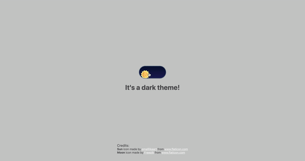
最后要做的就是将我们的组件导入 App.js 并向其传递所需的道具。 此外,为了增加一些交互性,我在主题更改时向标题传递了一个条件,以在“明亮”和“暗黑”之间切换
// App.js
<Toggle theme={theme} toggleTheme={toggleTheme} />
<h1>It's a {theme === 'light' ? 'light theme' : 'dark theme'}!</h1>
不要忘记为提供图标的 flaticon.com 作者致谢。
// App.js
<span>Credits:</span>
<small><b>Sun</b> icon made by <a href="https://www.flaticon.com/authors/smalllikeart">smalllikeart</a> from <a href="https://www.flaticon.com">www.flaticon.com</a></small>
<small><b>Moon</b> icon made by <a href="https://www.freepik.com/home">Freepik</a> from <a href="https://www.flaticon.com">www.flaticon.com</a></small>
现在好多了

useDarkMode 钩子
在构建应用程序时,我们应该牢记应用程序必须是可扩展的,这意味着可重用的,因此我们可以在许多地方甚至不同的项目中使用它。
这就是为什么如果我们将切换功能移到一个单独的位置会很棒的原因——所以,为什么不为此创建一个专门的帐户钩子呢?
让我们在项目 src 目录中创建一个名为 useDarkMode.js 的新文件,并将我们的逻辑移到这个文件中,并进行一些调整
// useDarkMode.js
import { useEffect, useState } from 'react';

export const useDarkMode = () => {
  const [theme, setTheme] = useState('light');
  const toggleTheme = () => {
    if (theme === 'light') {
      window.localStorage.setItem('theme', 'dark')
      setTheme('dark')
    } else {
      window.localStorage.setItem('theme', 'light')
      setTheme('light')
    }
  };

  useEffect(() => {
    const localTheme = window.localStorage.getItem('theme');
    localTheme && setTheme(localTheme);
  }, []);

  return [theme, toggleTheme]
};
我们在这里添加了一些东西。 我们希望我们的主题在浏览器会话之间持久存在,因此如果有人选择了暗黑主题,那么他们将在下次访问应用程序时获得该主题。 这是一个巨大的 UX 改进。 出于这些原因,我们使用 localStorage。
我们还实现了 useEffect 钩子来检查组件挂载。 如果用户之前选择了主题,我们将其传递给我们的 setTheme 函数。 最后,我们将返回我们的 theme,它包含选择的 theme 和 toggleTheme 函数,用于在模式之间切换。
现在,让我们实现 useDarkMode 钩子。 转到 App.js,导入新创建的钩子,从钩子中解构我们的 theme 和 toggleTheme 属性,并将它们放到它们应该在的位置
// App.js
import React from 'react';
import { ThemeProvider } from 'styled-components';
import { useDarkMode } from './useDarkMode';
import { lightTheme, darkTheme } from './theme';
import { GlobalStyles } from './global';
import Toggle from './components/Toggle';

function App() {
  const [theme, toggleTheme] = useDarkMode();
  const themeMode = theme === 'light' ? lightTheme : darkTheme;

  return (
    <ThemeProvider theme={themeMode}>
      <>
        <GlobalStyles />
        <Toggle theme={theme} toggleTheme={toggleTheme} />
        <h1>It's a {theme === 'light' ? 'light theme' : 'dark theme'}!</h1>
        <footer>
          Credits:
          <small>Sun icon made by smalllikeart from www.flaticon.com</small>
          <small>Moon icon made by Freepik from www.flaticon.com</small>
        </footer>
      </>
    </ThemeProvider>
  );
}

export default App;这几乎完美地工作了,但我们可以做一件小事来改善我们的体验。 切换到暗黑主题并重新加载页面。 您是否看到太阳图标在月亮图标之前短暂地加载了一瞬间?
之所以发生这种情况,是因为我们的 useState 钩子最初初始化了 light 主题。 之后,useEffect 运行,检查 localStorage,然后才将 theme 设置为 dark。
到目前为止,我找到了两种解决方案。 第一种是在我们的 useState 中检查 localStorage 中是否有值
// useDarkMode.js
const [theme, setTheme] = useState(window.localStorage.getItem('theme') || 'light');
但是,我不确定在 useState 中进行这样的检查是否是一个好习惯,所以让我向您展示我正在使用的第二种解决方案。
这个会稍微复杂一些。 我们将创建一个另一个状态并将其命名为 componentMounted。 然后,在 useEffect 钩子中,我们在其中检查我们的 localTheme,我们将添加一个 else 语句,如果 localStorage 中没有 theme,我们将添加它。 之后,我们将 setComponentMounted 设置为 true。 最后,我们将 componentMounted 添加到我们的 return 语句中。
// useDarkMode.js
import { useEffect, useState } from 'react';

export const useDarkMode = () => {
  const [theme, setTheme] = useState('light');
  const [componentMounted, setComponentMounted] = useState(false);
  const toggleTheme = () => {
    if (theme === 'light') {
      window.localStorage.setItem('theme', 'dark');
      setTheme('dark');
    } else {
      window.localStorage.setItem('theme', 'light');
      setTheme('light');
    }
  };

  useEffect(() => {
    const localTheme = window.localStorage.getItem('theme');
    if (localTheme) {
      setTheme(localTheme);
    } else {
      setTheme('light')
      window.localStorage.setItem('theme', 'light')
    }
    setComponentMounted(true);
  }, []);

  return [theme, toggleTheme, componentMounted]
};
您可能已经注意到,我们有一些重复的代码片段。 我们始终尝试在编写代码时遵循 DRY 原则,而这里我们有机会使用它。 我们可以创建一个单独的函数来设置我们的状态并将 theme 传递给 localStorage。 我认为,最好的名字是 setTheme,但我们已经使用过它了,所以让我们将其命名为 setMode
// useDarkMode.js
const setMode = mode => {
  window.localStorage.setItem('theme', mode)
  setTheme(mode)
};
有了这个函数,我们可以稍微重构一下我们的 useDarkMode.js
// useDarkMode.js
import { useEffect, useState } from 'react';
export const useDarkMode = () => {
  const [theme, setTheme] = useState('light');
  const [componentMounted, setComponentMounted] = useState(false);

  const setMode = mode => {
    window.localStorage.setItem('theme', mode)
    setTheme(mode)
  };

  const toggleTheme = () => {
    if (theme === 'light') {
      setMode('dark');
    } else {
      setMode('light');
    }
  };

  useEffect(() => {
    const localTheme = window.localStorage.getItem('theme');
    if (localTheme) {
      setTheme(localTheme);
    } else {
      setMode('light');
    }
    setComponentMounted(true);
  }, []);

  return [theme, toggleTheme, componentMounted]
};
我们只改变了代码一点点,但看起来好多了,更容易阅读和理解!
组件是否已挂载?
回到componentMounted属性。我们将使用它来检查我们的组件是否已挂载,因为这是在useEffect钩子中发生的事情。
如果它还没有发生,我们将渲染一个空的 div
// App.js
if (!componentMounted) {
  return <div />
};
以下是 App.js 的完整代码
// App.js
import React from 'react';
import { ThemeProvider } from 'styled-components';
import { useDarkMode } from './useDarkMode';
import { lightTheme, darkTheme } from './theme';
import { GlobalStyles } from './global';
import Toggle from './components/Toggle';

function App() {
  const [theme, toggleTheme, componentMounted] = useDarkMode();

  const themeMode = theme === 'light' ? lightTheme : darkTheme;

  if (!componentMounted) {
    return <div />
  };

  return (
    <ThemeProvider theme={themeMode}>
      <>
        <GlobalStyles />
        <Toggle theme={theme} toggleTheme={toggleTheme} />
        <h1>It's a {theme === 'light' ? 'light theme' : 'dark theme'}!</h1>
        <footer>
          <span>Credits:</span>
          <small><b>Sun</b> icon made by <a href="https://www.flaticon.com/authors/smalllikeart">smalllikeart</a> from <a href="https://www.flaticon.com">www.flaticon.com</a></small>
          <small><b>Moon</b> icon made by <a href="https://www.freepik.com/home">Freepik</a> from <a href="https://www.flaticon.com">www.flaticon.com</a></small>
        </footer>
      </>
    </ThemeProvider>
  );
}

export default App;
使用用户的首选颜色方案
这部分不是必需的,但它将使您获得更好的用户体验。此媒体功能用于检测用户是否已要求页面根据其 OS 设置使用浅色或深色主题。例如,如果用户的手机或笔记本电脑上的默认颜色方案设置为深色,您的网站将相应地更改其颜色方案。值得注意的是,此媒体查询仍在开发中,包含在 媒体查询级别 5 规范中,该规范处于编辑草案阶段。
此浏览器支持数据来自 Caniuse,其中有更多详细信息。数字表示浏览器在该版本及更高版本中支持该功能。
台式机
| Chrome | Firefox | IE | Edge | Safari |
|---|---|---|---|---|
| 76 | 67 | 否 | 79 | 12.1 |
移动设备/平板电脑
| Android Chrome | Android Firefox | Android | iOS Safari |
|---|---|---|---|
| 127 | 127 | 127 | 13.0-13.1 |
实现非常简单。因为我们正在使用媒体查询,所以我们需要在useEffect钩子中检查浏览器是否支持它并设置相应的主题。为此,我们将使用window.matchMedia来检查它是否存在以及是否支持深色模式。我们还需要记住localTheme,因为如果它可用,我们不想用深色值覆盖它,当然,除非该值设置为浅色。
如果所有检查都通过,我们将设置深色主题。
// useDarkMode.js
useEffect(() => {
if (
  window.matchMedia &&
  window.matchMedia('(prefers-color-scheme: dark)').matches &&
  !localTheme
) {
  setTheme('dark')
  }
})如前所述,我们需要记住localTheme的存在 - 这就是为什么我们需要实现我们之前检查它的逻辑。
以下是我们之前的内容
// useDarkMode.js
useEffect(() => {
const localTheme = window.localStorage.getItem('theme');
  if (localTheme) {
    setTheme(localTheme);
  } else {
    setMode('light');
  }
})
让我们混合一下。我用三元运算符替换了 if 和 else 语句,以使内容更易读
// useDarkMode.js
useEffect(() => {
const localTheme = window.localStorage.getItem('theme');
window.matchMedia && window.matchMedia('(prefers-color-scheme: dark)').matches && !localTheme ?
  setMode('dark') :
  localTheme ?
    setTheme(localTheme) :
    setMode('light');})
})
以下是包含完整代码的 userDarkMode.js 文件
// useDarkMode.js
import { useEffect, useState } from 'react';

export const useDarkMode = () => {
  const [theme, setTheme] = useState('light');
  const [componentMounted, setComponentMounted] = useState(false);
  const setMode = mode => {
    window.localStorage.setItem('theme', mode)
    setTheme(mode)
  };

  const toggleTheme = () => {
    if (theme === 'light') {
      setMode('dark')
    } else {
      setMode('light')
    }
  };

  useEffect(() => {
    const localTheme = window.localStorage.getItem('theme');
    window.matchMedia && window.matchMedia('(prefers-color-scheme: dark)').matches && !localTheme ?
      setMode('dark') :
      localTheme ?
        setTheme(localTheme) :
        setMode('light');
    setComponentMounted(true);
  }, []);

  return [theme, toggleTheme, componentMounted]
};试试吧!它更改模式,在localStorage中持久保存主题,并在可用时根据 OS 颜色方案设置默认主题。
恭喜,我的朋友!干得好!如果您对实施有任何疑问,请随时 给我发消息!
很酷!我喜欢它!干得好!
看起来很多,因为您可以在文档上添加一个类似
theme-light或theme-dark的 body 类,并在 CSS 中为两者设置规则。例如,.theme-light { background: white; }和.theme-dark { background: black; }。也许可以添加 CSS 过渡,以便用户可以实时切换并看到它为了炫耀而改变。IMO,深色模式 100% 是一个 CSS 问题。所有这些 React 和类似的东西都用于一些非常简单的东西,感觉有点过分。如果您已经有了 React 应用程序,那就说得通。动画和抛光也很好看!
你好!每项技术都有其用例,我只想展示众多实现此功能的方法中的一种。我并不意味着如果您想要深色主题,就必须这样做,我只是想展示当您已经拥有一个带有 styled-components 的 React 应用程序时可能的方法 :)
我以前使用过 ThemeProvider 和 MaterialUI,我的问题一直出现在编写测试时。没有上下文,所有东西都会开始崩溃,最终你不得不在 ThemeProvider 中包装所有测试用例。MaterialUI 为此目的提供了专门包装的 enzyme 函数,但它们并不总是有效,并且为我们的测试增加了额外的复杂性
我可能误解了你的解释,但为什么要让深色/浅色模式变得如此复杂(在你的树中添加额外的依赖项和组件)?
在应用程序引导时使用钩子,它会更改 body 的类以切换正确的 CSS 定义,这听起来可以完成工作。
根据您的经验,采用您的解决方案而不是更传统的 CSS 方法有哪些优点?
我从我的经验中意识到,优秀的开发人员经常不擅长编写 CSS。编写深色/浅色 CSS 方法可能很困难!
感谢您分享您的知识。很高兴阅读您的文章。
嗨!
本文的主要目的是展示深色模式功能的众多实现方式之一,并让人们更深入地了解事物的工作原理,例如
ThemeProvider、GlobalStyles、prefers-color-scheme等。你说得对,这不是最简单的解决方案,但是,许多项目已经使用了 styled-components,这对他们来说可能很有效。
我认为,在选择采用什么解决方案时,这主要取决于您的项目及其需求。因为没有一个完美的解决方案,所有解决方案都有自己的优缺点 :)
喜欢这个!每天学习新东西真好!
谢谢,喜欢这个!
我尝试实现它,并将我的切换开关嵌套在子组件中。我认为如果我在任何地方调用 toggleTheme(),它都会重新渲染整个 DOM 树,但事实并非如此。
我是否正确地认为我需要使用 React Context 来做到这一点?
我遇到了同样的问题 :( 我的切换开关在“NavBar”组件中,但它只在“_app.js”中工作
嗨!
首先:很棒的文章!!
快速问题:我正在计划一个新的 react 应用程序,希望有主题选项并使用 styled-components,但我还想使用 material ui 作为 UI 样式库。是否可以将两者结合起来,这样我就可以获得 material ui 组件的益处,同时还可以使用 styled-components 创建自定义组件,并像你这里展示的那样有主题选项?(我知道我问了很多)