CSS ::before 和 ::after 伪元素 允许您在任何非替换元素之前和之后插入“内容”(例如,它们适用于 <div>,但不适用于 <input>)。这有效地允许您在网页上显示 HTML 内容中可能不存在的内容。您不应该将它用于实际内容,因为它可访问性很差,因为您甚至无法选择和复制以这种方式插入页面上的文本——它只是装饰性内容。
在本文中,我将带您逐步了解七个不同的示例,这些示例展示了如何使用 ::before 和 ::after 创建有趣的效果。
请注意,对于大多数示例,我只解释了与 CSS 伪元素相关的代码部分。也就是说,所有 CSS 都可以在嵌入式演示中获得,如果您想查看更多样式的代码,请访问。
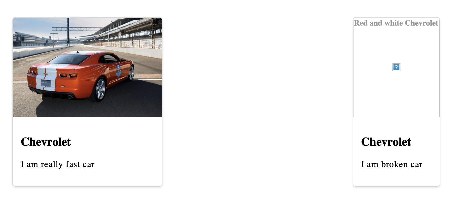
为损坏的图像添加样式
当用户访问您的网站时,他们的互联网连接(或超出您控制范围的因素)可能会阻止您的图像下载,因此浏览器会显示损坏的图像图标以及图像的 alt 文本(如果它确实存在)。

如何改用自定义占位符?您可以使用 ::before 和 ::after 以及一些 CSS 定位来实现此功能。

首先,我们需要对图像元素使用相对定位。我们将稍后对其中一个伪元素使用绝对定位,因此此 relative 位置确保伪元素位于图像元素的内容内,而不是完全脱离文档流。
img {
  display: block; /* Avoid the space under the image caused by line height */
  position: relative;
  width: 100%
}
接下来,让我们使用图像的 ::before 伪元素创建损坏图像效果的区域。我们将使用浅灰色背景和略暗的边框来开始。
img::before {
  background-color: hsl(0, 0%, 93.3%);
  border: 1px dashed hsl(0, 0%, 66.7%);
  /* ... */
}
<img> 是一个替换元素。为什么要在它上面使用 ::before 伪元素?它不会起作用!没错。在这种情况下,伪元素将在图像加载失败时显示在 Chrome 和 Firefox 中,这正是您想要的。同时,Safari 仅显示应用于 alt 文本的样式.
样式应用于损坏图像的左上角。

到目前为止,一切都很好。现在我们可以将其设为块级元素(display: block)并为其指定一个填充整个可用空间的高度。
img::before {
  /* ... */
  display: block;
  height: 100%;
}
我们可以进一步细化样式。例如,让我们将角部圆角化。我们还应该为 alt 文本提供一些呼吸空间,方法是为伪元素指定完整宽度和绝对定位,以便更好地控制将事物放置在我们想要的位置。
img::before {
  /* ... */
  border-radius: 4px;
  content: "";
  position: absolute;
  width: 100%;
}
如果您在此处停止并检查您的工作,您可能会挠头,因为 alt 文本突然消失了。

这是因为我们将 content 设置为空字符串(我们需要显示生成的 content 和样式)并覆盖整个空间,包括实际的 alt 文本。它在那里,我们只是看不到它。
如果我们以替代(明白了吗?)的方式显示 alt 文本,我们可以看到它,这次借助 ::after 伪元素。content 属性实际上可以使用 attr() 函数显示图像的 alt 属性文本
img::after {
  content: attr(alt);

  /* Some light styling */
  font-weight: bold;
  position: absolute;
  height: 100%;
  left: 0px;
  text-align: center;
  top: 1px;
  width: 100%;
}
这太棒了!至少在 Chrome 中是如此。

但是,在 Firefox 中,情况并非如此。

alt 文本发生冲突。一个快速的解决方法是使用属性选择器直接定位 alt 属性(在本例中为 img[alt]),并在其中定位类似的样式,以使内容与 Chrome 相匹配。
img[alt] {
  text-align: center;
  font-weight: bold;
  color: hsl(0, 0%, 60%);
}
现在,我们有一个在 Chrome 和 Firefox 中一致的出色占位符。
自定义引用
引用是来自引用作品的引文或摘录。它们还可以提供一个绝佳的机会,可以用视觉上有趣的内容打破一堵文本墙。
有各种方法可以为引用添加样式。Chris 有一组五种样式,可以追溯到 2007 年。
我想看看另一种技术,一种包含 ::before 和 ::after 的技术。就像我们在上一个示例中看到的那样,我们可以使用 content 属性来显示生成的 content,并应用其他属性来装饰它。让我们在引用的开头和结尾处放置大引号。

HTML 很简单
<blockquote>
  <!-- Your text here -->
</blockquote>
在 CSS 中添加一些装饰
blockquote {
  font-style: italic;
  line-height: 1.618;
  font-size: 1.2em;
  width: 30em;
  position: relative;
  padding: 40px 80px;
}
请注意其中的 position: relative,因为正如您将了解到的那样,它对于定位引用至关重要。
您可能已经猜到,我们将使用 ::before 来表示第一个引号,使用 ::after 来表示结束引号。现在,我们只需在两者上调用 content 属性并在其中生成标记即可。但是,CSS 使用 open-quote 和 close-quote 值为我们提供了支持。
blockquote::before {
  content: open-quote;
  /* Place it at the top-left */
  top: 0;
  left: 0;
}

blockquote::after {
  content: close-quote;
  /* Place it at thee bottom-right */
  bottom: 0;
  right: 0;
}
这为我们提供了所需的引号,但请允许我整理一下样式
blockquote::before,
blockquote::after {
  background-color: #cccccc;
  display: block;
  width: 60px;
  height: 60px;
  line-height: 1.618;
  font-size: 3em;
  border-radius: 100%;
  text-align: center;
  position: absolute;
}图标项目列表
我们在 HTML 中有有序 (<ol>) 和无序 (<ul>) 列表。两者都有浏览器用户代理样式表指定的默认样式。但是,使用 ::before 伪元素,我们可以用自己的内容覆盖这些“默认”样式。猜猜看?我们可以在 content 属性上使用表情符号 (😊)!
.name-list li::before {
  content: "😊";
  margin-right: 15px;
  font-size: 20px;
}虽然这很好,但值得注意的是,我们实际上可以使用 ::marker 伪元素,该元素专门用于为列表标记添加样式。Eric Meyer 展示了它是如何工作的,从长远来看,这可能是一个更好的选择。
动画切换开关
为表单添加样式最巧妙的技巧之一是使用标准 HTML 复选框创建切换开关。事实上,Preethi Sam 最近分享了一种方法,该方法在展示几种其他复选框样式技巧时使用 CSS 遮罩。
顾名思义,切换开关用于在复选框元素的选中和未选中状态之间切换。
<form class="container">
  <label class="switch">
    <input type="checkbox" />
  </label>
</form>
所有自定义都归功于通过 ::before 和 ::after 伪元素添加到 <input> 元素的修改。但首先,这里有一些 <form> 元素的基本 CSS
.container {
  background: #212221;
  background: linear-gradient(to right, #1560bd, #e90);
  border-radius: 50px;
  height: 40px;
  position: relative;
  width: 75px;
}
我们将“隐藏”复选框的默认外观,同时使其占据全部空间。奇怪吧?它不可见,但实际上仍然存在。我们通过以下方式实现这一点:
- 将位置更改为
absolute, - 将外观设置为
none,以及 - 将
width和height设置为100%。
input {
  -webkit-appearance: none; /* Safari */
  cursor: pointer; /* Show it's an interactive element */
  height: 100%;
  position: absolute;
  width: 100%;
}
现在,让我们使用 ::before 伪元素为 <input> 元素添加样式。此样式将更改输入的外观,使我们更接近最终结果。
input::before {
  background: #fff;
  border-radius: 50px;
  content: "";
  height: 70%;
  position: absolute;
  top: 50%;
  transform: translate(7px, -50%); /* Move styling to the center of the element */
  width: 85%;
}
什么,等等?您可能会认为 ::before 不会对替换元素(例如 <input>)起作用。没错,但仅当输入类型为 image(等效于 <img> 元素)时才会出现这种情况。其他表单控件(例如复选框)在HTML 规范中定义为非替换元素.
接下来,我们需要创建“切换”按钮,并且碰巧我们仍然可以使用 ::after 伪元素来创建它。但是,有两点值得一提:
background是一个linear-gradient。- 使用
transform属性将“切换”按钮移至<input>的中心。
input::after {
  background: linear-gradient(to right, orange, #8e2de2);
  border-radius: 50px;
  content: "";
  height: 25px;
  opacity: 0.6;
  position: absolute;
  top: 50%;
  transform: translate(7px, -50%);
  transition: all .4s;
  width: 25px;
}
尝试点击切换按钮。什么也没发生。这是因为我们实际上并没有改变 <input> 的选中状态。即使我们改变了,结果也是…令人不快。

解决办法是将 :checked 属性应用于 <input> 的 ::after 伪元素。通过专门定位复选框的选中状态并将其链接到 ::after 伪元素,我们可以将切换按钮移回原位。
input:checked::after {
  opacity: 1;
  transform: translate(170%, -50%);
}渐变边框
我们可以用边框装饰图片,使它们更突出或更无缝地融入设计。你知道我们可以在边框上使用渐变吗?没错,我们可以用 `::before` (当然,还有 其他方法)。
核心思想是在图像上创建一个渐变,并使用 CSS 的 `z-index` 属性,并赋予它一个负值。负值将渐变拉到堆叠顺序中的图像下方。这意味着只要渐变的 `z-index` 为负值,图像就会始终显示在最上面。
.gradient-border::before {
  /* Renders the styles */
  content: "";
  /* Fills the entire space */
  position: absolute;
  top: 0;
  left: 0;
  bottom: 0;
  right: 0;
  /* Creates the gradient */
  background-image: linear-gradient(#1a1a1a, #1560bd);
  /* Stacks the gradient behind the image */
  z-index: -1;
}

figure {
  /* Removes the default margin */
  margin: 0;
  /* Squeezes the image, revealing the gradient behind it */
  padding: 10px;
}渐变叠加
这与我们在上一个示例中所做的一样,但是在这里,我们是在图像的顶部应用渐变。为什么我们要这样做?这是一种为图像添加纹理和深度的不错方法。或者,如果图像顶部有文字,并且需要额外的对比度以提高可读性,也可以使用它来使图像变亮或变暗。
虽然这与我们刚刚所做的一样,但是你会注意到一些明显的差异。
figure::before {
  background-image: linear-gradient(to top right, #1a1a1a, transparent);
  content: "";
  height: 100%;
  position: absolute;
  width: 100%;
}
看到了吗?没有 `z-index`,因为渐变叠加在图像顶部是可以的。我们还在背景渐变中引入了透明度,使图像能够透过渐变。就像叠加一样。
自定义单选按钮
我们大多数(如果不是全部)人都会尝试自定义 HTML 单选按钮的默认样式,这通常是通过 `::before` 和 `::after` 完成的,就像我们在前面的复选框中所做的那样。

我们首先设置一些基本样式,只是为了准备工作。
/* Centers everything */
.flex-center {
  align-items: center;
  display: flex;
  justify-content: center;
}

/* Styles the form element */
.form {
  background: #ccc;
  height: 100vh;
  width: 100%;
}

/* Styles the inputs */
.form-row {
  background: #fff;
  border-radius: 50px;
  height: 40px;
  margin: 10px;
  overflow: hidden;
  position: relative;
  width: 150px;
}
现在让我们使用 `appearance: none;` 移除单选按钮的默认样式。
.form-input {
  -webkit-appearance: none; /* Safari */
  appearance: none;
}
`::before` 应该位于单选按钮的左上角,当它被选中时,我们更改它的背景颜色。
.form-input::before {
  /* Renders the styles */
  content: '';
  /* Shows that it's interactive */
  cursor: pointer;
  /* Positions it to the top-left corner of the input */
  position: absolute;
  top: 0;
  left: 0;
  /* Takes up the entire space */
  height: 100%;
  width: 100%;
}

/* When the input is in a checked state... */
.form-input:checked::before {
  /* Change the background color */
  background: #21209c;
}
我们仍然需要使用 `::after` 来完善一些东西。具体来说,当单选按钮被选中时,我们想将圆形环的颜色更改为白色,因为在当前状态下,圆形环是蓝色的。
.form-input::after {
  /* Renders the styles */
  content: '';
  /* Shows that it's interactive */
  cursor: pointer;
  /* A little border styling */
  border-radius: 50px;
  border: 4px solid #21209c;
  /* Positions the ring */
  position: absolute;
  left: 10%;
  top: 50%;
  transform: translate(0, -50%);
  /* Sets the dimensions */
  height: 15px;
  width: 15px;
}

/* When the input is in a checked state... */
.form-input:checked::after {
  /* Change ::after's border to white */
  border: 4px solid #ffffff;
}
表单标签在这里仍然不可用。我们需要直接定位表单标签来添加颜色,并且当表单输入被选中时,我们将颜色更改为可见的颜色。
.form-label {
  color: #21209c;
  font-size: 1.1rem;
  margin-left: 10px;
}单击按钮,仍然没有反应。这是怎么回事。`::before` 和 `::after` 上的 `position: absolute` 会覆盖被选中的单选按钮,因为 HTML 文档层次结构中发生的任何事情都会被覆盖,除非它们被移动到 HTML 文档中的新位置,或者它们的定位通过 CSS 进行了更改。因此,每次单选按钮被选中时,它的标签都会被覆盖。
你可能已经知道如何解决这个问题,因为我们在前面的示例中解决了类似的问题。我们将 `z-index: 1`(或 `position: absolute`)应用于表单标签。
.form-label {
  color: #21209c;
  font-size: 1.1rem;
  margin-left: 10px;
  z-index: 1; /* Makes sure the label is stacked on top */
  /* position: absolute; This is an alternative option */
}总结
我们介绍了七种不同的方法,可以使用 `::before` 和 `::after` 伪元素来创建有趣的特效,自定义默认样式,制作有用的占位符,以及为图像添加边框。
我们绝没有涵盖利用这些可以通过 CSS 选择的额外元素所能实现的所有可能性。然而,Lynn Fisher 将此作为一种爱好,用 单个元素制作出惊人的设计。我们也不能忘记 Diana Smith 的 CSS 艺术,它在多个地方使用了伪元素来获得逼真的绘画效果。
你也可以使用 :before 和 :after 来制作像 a.singlediv.com 这样的 CSS 艺术。
如果你想在边框上设置一个图像(渐变或其他),我建议你使用 border-image 属性,而不是使用伪元素。
Border-image 对这种(更高级的)用例具有相当普遍的浏览器支持。
来自今年的一篇文章中的一些其他例子
https://codersblock.com/blog/diving-into-the-before-and-after-pseudo-elements/
我要向你表示衷心的感谢,因为你教会了我这些新的概念和艺术编码风格技巧。我可能没有理解所有解释,但是我可以告诉你,我确实学到了新的概念。